Brand guidelines
Textures
The parent's textures come from its name and its place: strands that intertwine, the bridge between Charleston and Mt Pleasant, and the tidal marsh around them. Each is drawn by a generator, so every file is exact and repeatable, and each takes any brand color.
01 · The set
Twine, cables, tide.
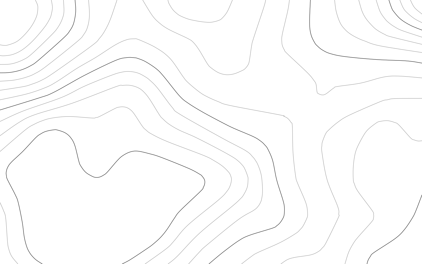
Strokes only, one weight per file. The contours are traced at even heights with every fourth line stronger, like an index contour on a survey map.
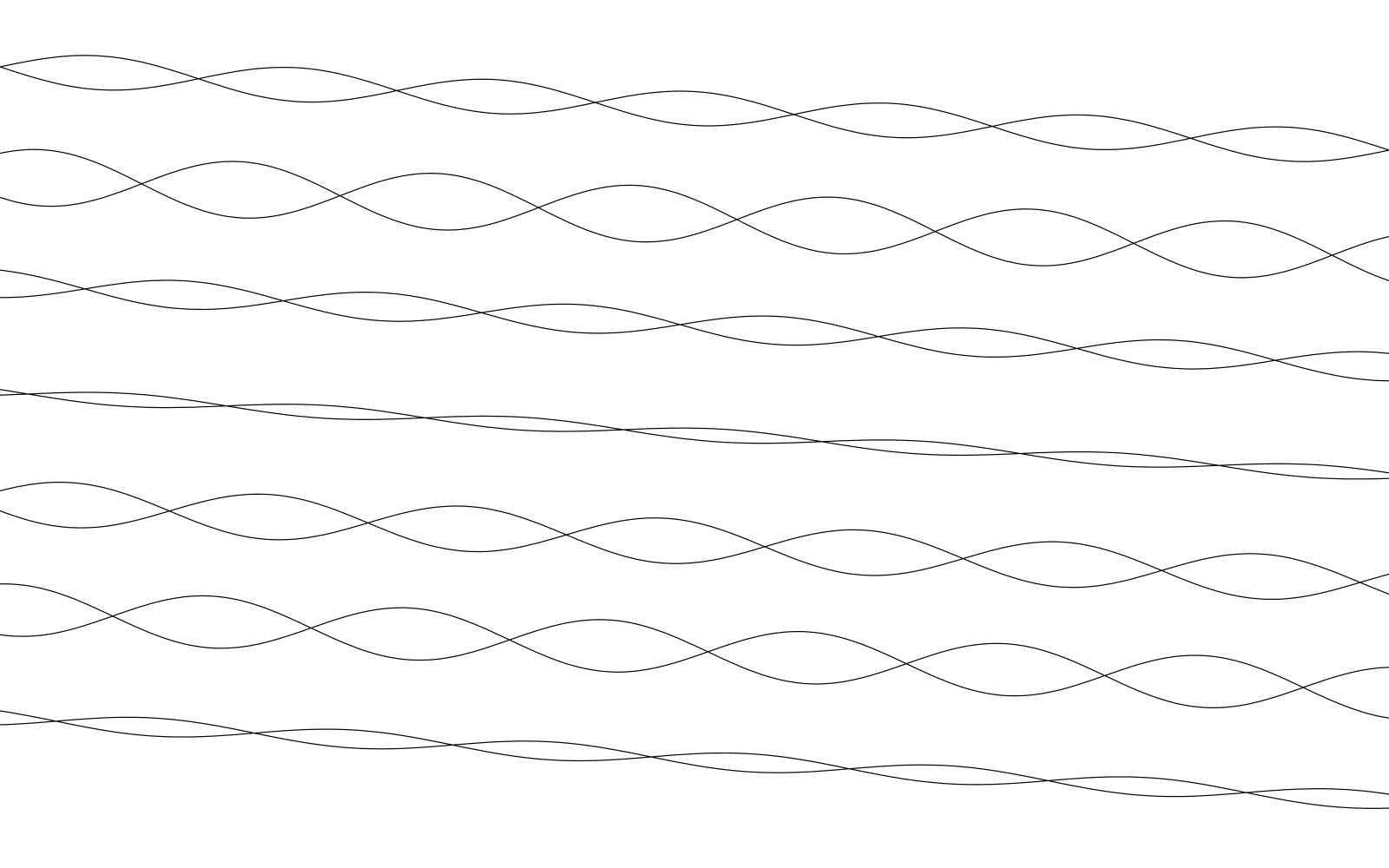
Twine
Pairs of lines winding around each other and crossing: the name, drawn. The default.
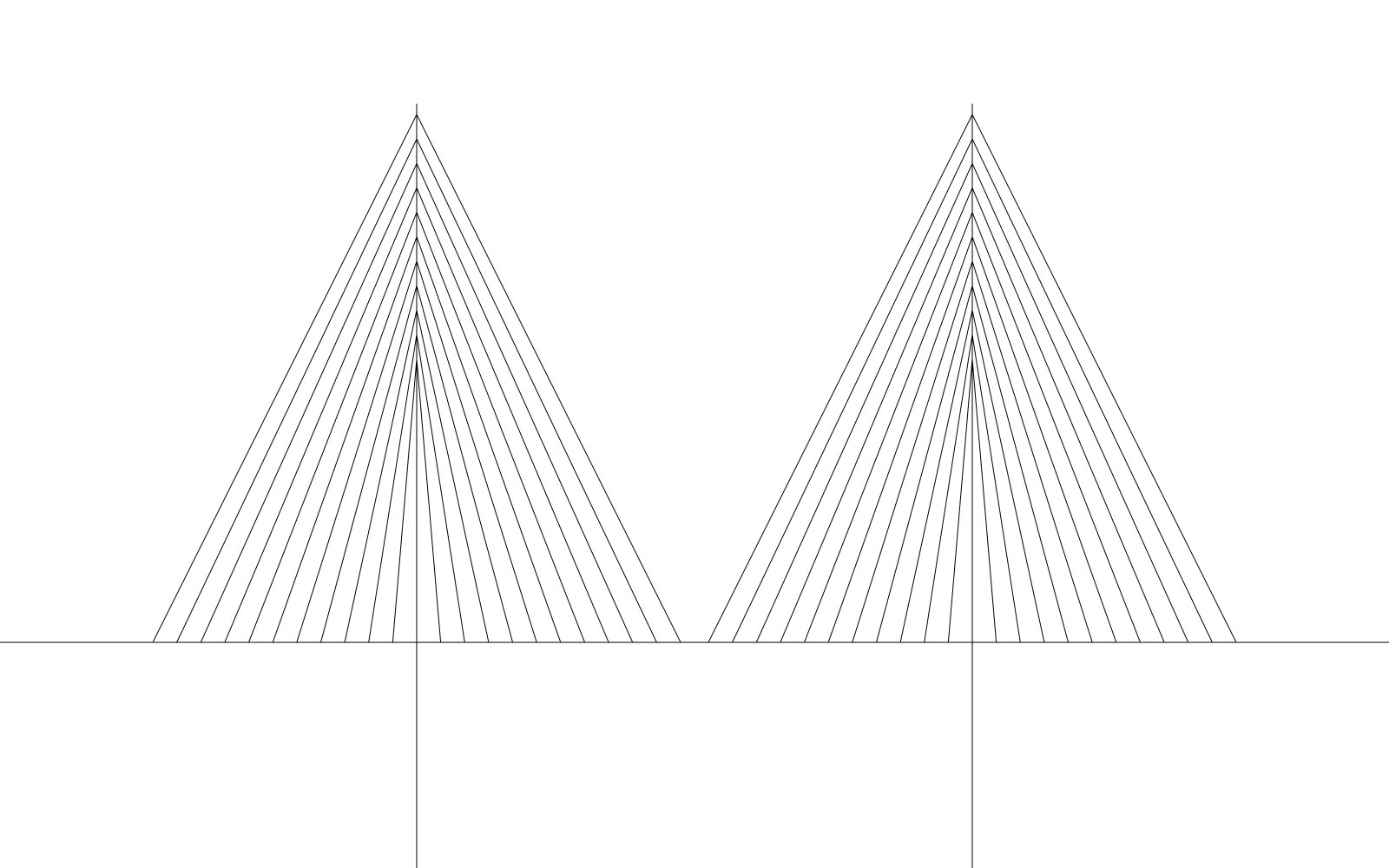
Cables
Two pylons and their fanned stays, after the Ravenel Bridge. For covers and dividers.
Marsh
Tidal contours, many small islands. For wide formats.

Harbor
Wide, calm contours. Behind large type.
02 · With the lockup
One texture, one line.
A texture sits behind the lockup or a short line, never behind paragraphs. The twine reads best on Evergreen; the cables on Paper.
03 · Use
Where textures go, and where they don't.
Yes
- Slide covers and section dividers.
- Social images, event screens, the backs of printed pieces.
- Behind the lockup or a single short line.
Strength
- Evergreen lines at 12 to 20% on Paper or white.
- Mint lines at 15 to 25% on Evergreen.
- Evergreen lines at 15 to 25% on Mint.
No
- Behind paragraphs, forms or data. The website stays plain.
- Two textures on one surface, or a texture on a photograph.
- Recoloring parts of a texture or animating it for attention.